Writers Guild Library
A Home for the Premiere Collection of Award-Winning and Critically-Acclaimed Scripts
John Dutton was hired to assess the limitations of the current library within the headquarters of the Writers Guild, and create a new home for the collection in a converted bank space at the corner of Third and Fairfax, a very busy and highly visible intersection in Los Angeles. Through analysis, planning, and then design, Dutton Architects helped the Writers Guild Foundation best reflect their mission of educating the public about the role of writers. The intent was to make a public library that helped promote this mission.
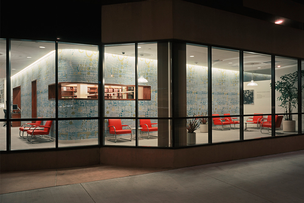
Inserting the “box:” reading room inside, billboard outside
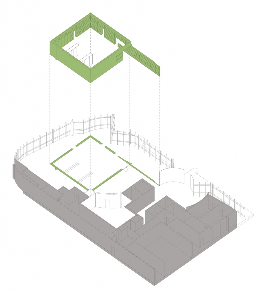
The reading room was conceived as a box inserted into the odd geometries of the existing commercial building. This box also helped create a visual and audial separation from the busy street, and the outside of the box was designed as a billboard to be visible by the thousands of daily passerbys. A custom graphic of scripts was designed to wrap the box.
A diagram shows the insertion of the pure “box” reading room into the awkward existing space. One side of the box breaks free, extending an arm of welcome into the main building lobby.
Library entry vestibule
View of the library from the main building entry.
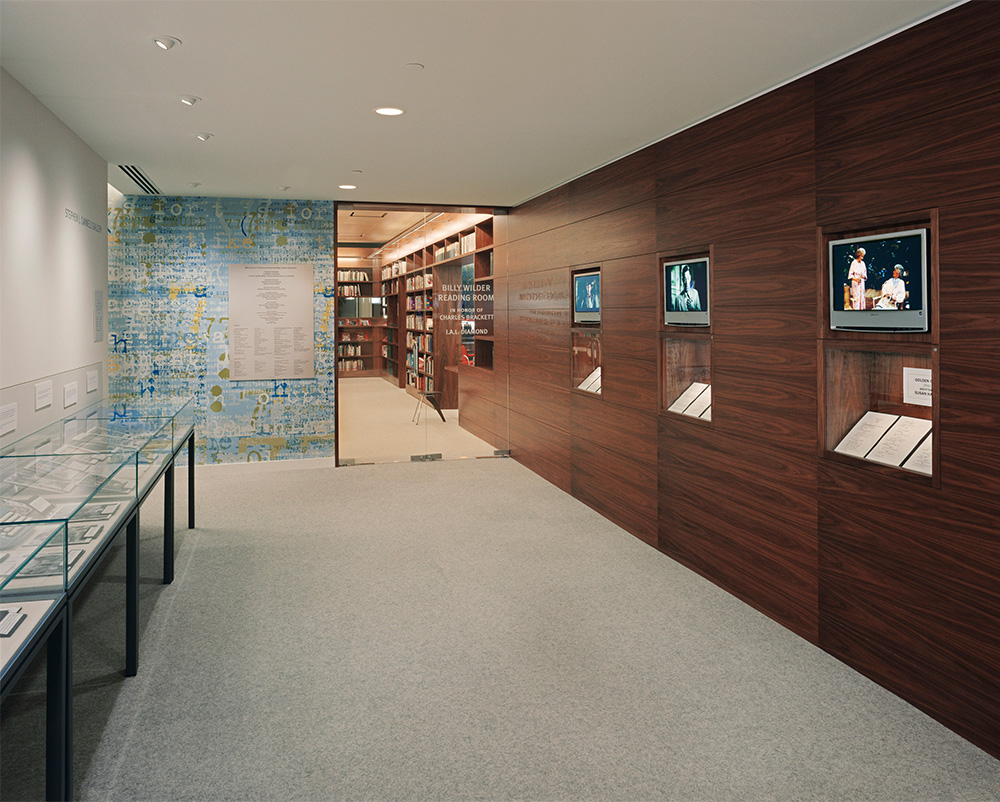
Dutton Architects used walnut for the interior of the “box” and a custom wallpaper of superimposed scripts for the outside, or wrapper, of the box. One wall of the box “breaks free” and extends out toward the main building lobby.
On this wall are scenes from movies and TV shows silently looping, with the pages of the script for that scene on display below. This was one of the initial concepts Dutton Architects developed as a way of showcasing the role of the writer in WRITING the words, as opposed to understanding the words merely as spoken my actors.
The Writers Table
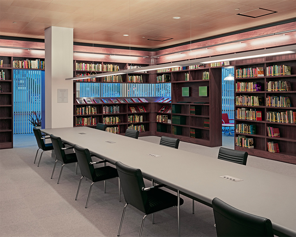
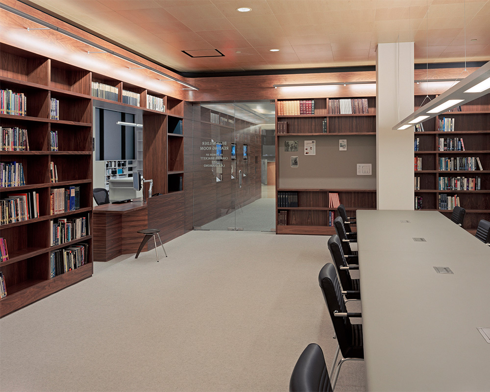
The interior of the library itself is all walnut – in distinction from the colorful exterior wrapper graphic.
A “Writers Table” spanned between two columns and was intended to reflect the collegial collaboration of a writers room for a television production. Rolled linoleum edged allow writers to work on a soft counter and not get creases from corners on their arms.
Reading room
A view from within the reading room toward the entry. The box of shelves is interrupted occasionally by other elements- in this case a bulletin board, and a desk for visitors to check in with the reference librarian. Custom maple acoustic ceiling tiles incorporated lighting and HVAC too.
The Writers Table is visible on the right, and one of the walls that extends into the main building lobby is visible in the background.
A/V Nooks
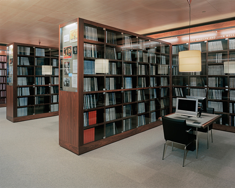
One of the many A/V nooks where visitors can watch a show or movie while reviewing the script. The naming of these nooks were also a good fundraising source. Dutton Architects helped the Writers Guild Foundation raise money both by directly presenting the project to potential fundraisers, but also by helping ascertain which design components could be singularly named by donors.
Offices
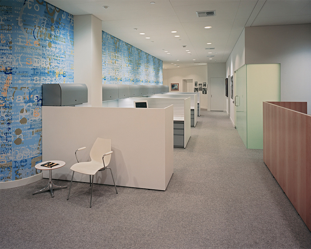
The offices of the Writers Guild Foundation were intended to contrast with the reading room.
Whereas the reading room is a dark, walnut encased space, reminiscent of traditional libraries, the offices were bright and light, more pop and modern.
From the Executive Director:
“When John Dutton presented the Writers Guild Foundation New Library Committee with his proposal for a new library, archive space and offices we knew immediately we had found the right person. We had to deal with an awkward space that presented some unique challenges, and John’s approach was not only imaginative, practical, modern and traditional all at the same time, he had also researched our organization and our needs so thoroughly that he seemed to know us better than we knew ourselves. In fact he came up with ideas and solutions we didn’t even know we needed. The library has been open five years now and we are as proud and delighted with the results today as we were the day it opened. Apart from the elegance of the overall design, the quality of the work and attention to detail are still a source of joy to us.”
Angela Kirgo, Executive Director, Writers Guild Foundation
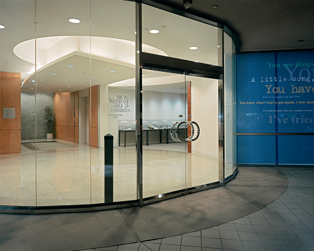
The Writers Guild Library was intended to lure the visitors to the main building.
The entry to the main lobby of the building. The main sign and a rotating display case is visible in this photo.
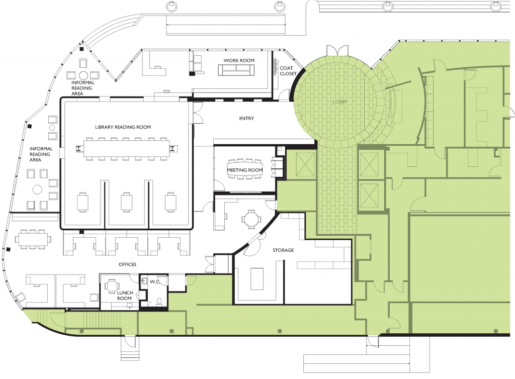
The Plan: Bringing order to a difficult site
A plan shows the area of the library in white. Clearly the geometries of the space, a former bank branch, are awkward and not conducive to a serene environment to study scripts. There is also a long curtainwall of windows facing the busy street- which was not soundproof. Our solution was to create a “box” in the middle of the space- a kind of pure reading room. The space “left-over” between this box and the awkward perimeter of the building, was used for support spaces- offices, lounge, reading nooks, closets, storage, etc.
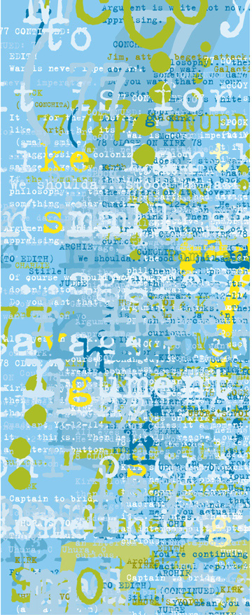
A panel of the custom wallpaper which wraps the main reading room ‘box.’ It is comprised of three award-winning scripts superimposed on each other to create an abstract tapestry. The words create a kind of billboard, or facade. The history of putting words on the front of libraries is well-established, as can be seen on the Bibliotheque Sainte Genevieve in Paris, or the Avery Library at Columbia University.
Book stacks as wall
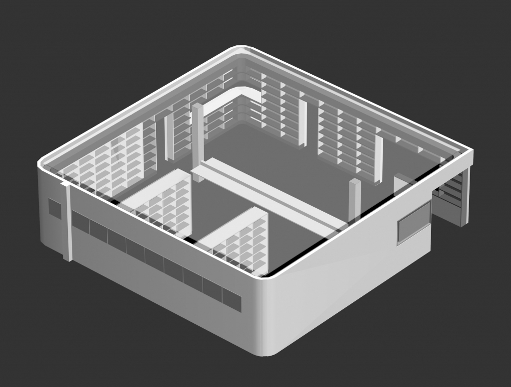
One of the early studies of the ‘box’ reading room. The requirement for specific lengths of shelving, A/V nooks, a writers table, and display area had to be carefully integrated into the space.


