La Mesa Residence
Our client, head of a music recording company, for whom we had designed a couple very modern projects, bought a historic adobe house by John Byers, one of the preeminent architects of Los Angeles in the first half of the twentieth century. Dutton Architects relished the challenge of respecting the history and craft of the original, yet through additions and renovations, making it livable for twentieth-century living. The restoration of the original was guided by the consultant that oversees the Getty Trust’s adobe restoration projects.
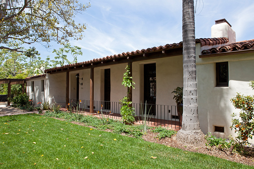
A historic adobe house bought by a prominent leader in the music and technology worlds.
Our client, head of a music recording company, for whom we had designed a couple very modern projects, bought a historic adobe house by John Byers, one of the preeminent architects of Los Angeles in the first half of the twentieth century.
Dutton Architects relished the challenge of respecting the history and craft of the original, yet through additions and renovations, making it livable for twentieth-century living. The restoration of the original was guided by the consultant that oversees the Getty Trust’s adobe restoration projects.
Entering to the outside
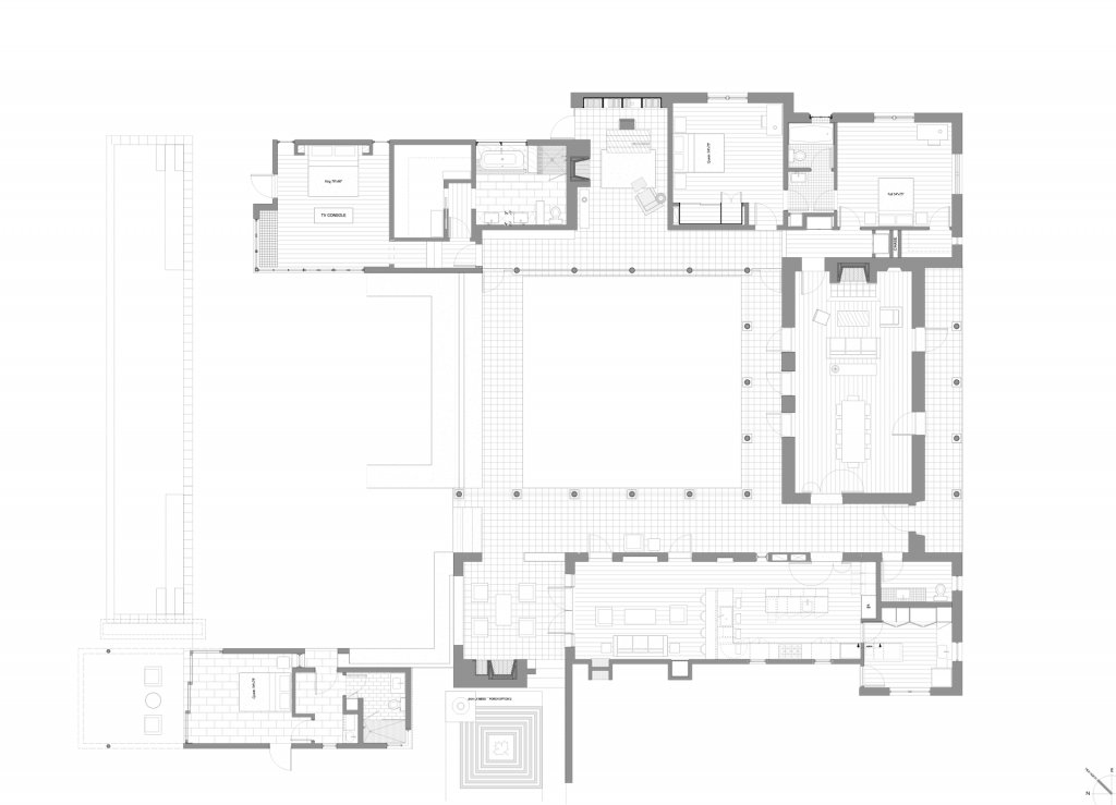
The design of Dutton Architects reinforced the idea of simple rooms built around an open courtyard, linked by a deep roof overhang for shade. The idea is basically an interpretation of a traditional Spanish courtyard house or hacienda.
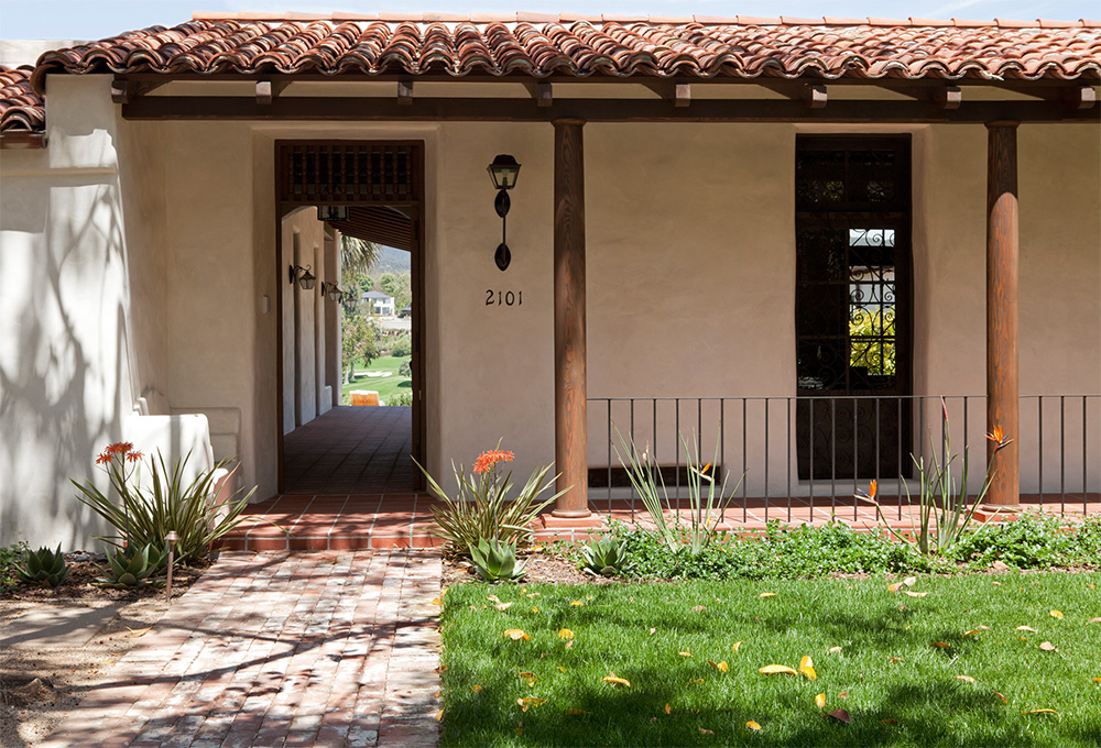
In this image, one can see that the front door leads to a covered vestibule that is open to the air and views.
all photos by Undine Prohl
At first our client told us “I don’t need air conditioning”
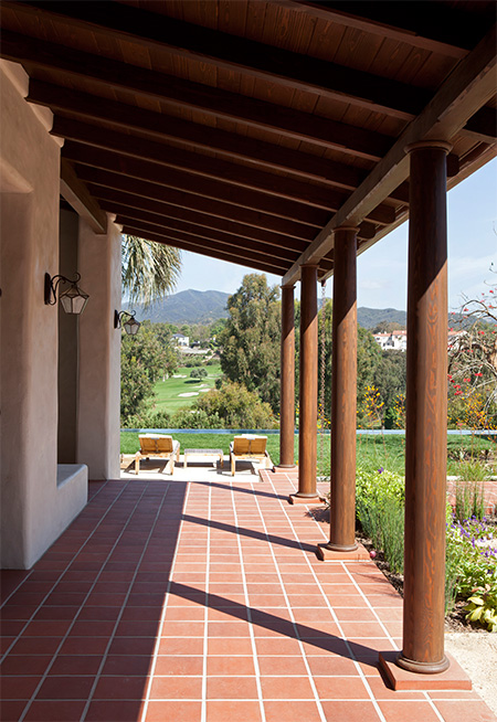
This view from the entry vestibule. A paved floor of custom terracotta tiles, covered by a deep covered wood pergola, leads to a view of the pool in the foreground, the Riviera Country Club in the middle ground, and the Santa Monica Mountains in the background.
The idea of a passively shaded, cooled building, along with radiant heat in all floor surfaces, inside and out, made air-conditioning not necessary. Our client wanted to feel that he was living life simply as they would have when the original house was built, without the need for modern cooling and heating technologies.
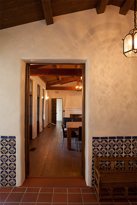
Entry vestibule to living room
This is a view to the original living room from the entry vestibule. The handpainted tiles are original and were saved for use in the restoration. The walls are original adobe.
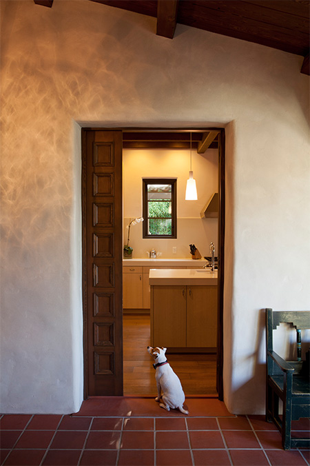
Entry vestibule to kitchen
Across the entry vestibule from the living room is the new kitchen- part of the addition to the original house. A pair of paneled wood doors can close down the kitchen and the living room from the entry vestibule. But when opened, it creates a large continuous connection through both sides of the house.
The kitchen is clearly more modern than the original house, a fact Dutton Architects did not want to hide.
A grand, spare, restored living room
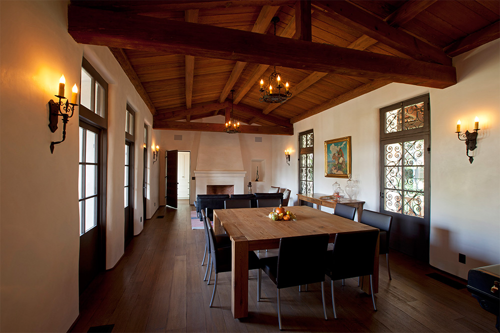
The original living room featured tall heavy timber trusses, wood ceilings and floors, a massive fireplace, and french doors with decorative iron screens. Dutton Architects sandblasted the ceiling and trusses, rebuilt the fireplace, restored the adobe walls, replaced the doors and windows, and installed a new floor with radiant heat.
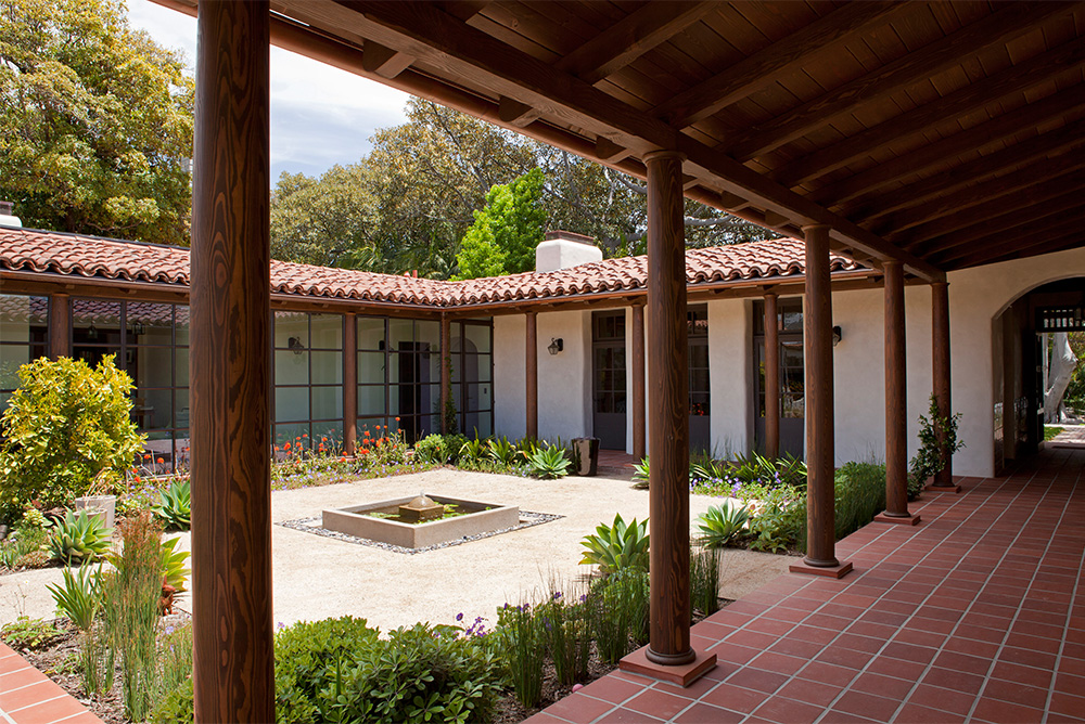
Through new additions, Dutton Architects created a courtyard, with a central fountain, a decomposed granite (d.g.) surface, and corner and edge plantings of native plants that might have been used in the original 1920’s house.
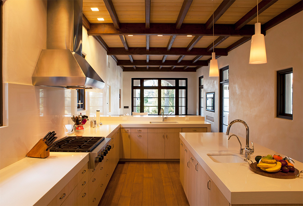
A modern kitchen, sympathetic to the adobe original house
The kitchen was designed with all the modern detailing- flush overlay white-oak cabinetry, Caesarstone counters, Wolf appliances, etc, but Dutton Architects carefully tweaked the details to work with the toughness of the rest of the house. The counter, for example, is 3 1/2″ thick.
The kitchen counter steps up to bar counter height, then waterfalls down to the ground in order to create an informal sitting area with bar stools. This area also creates an informal separate of the kitchen from the adjacent family room.
The custom wood paneled doors are visible on the left, and the door to the wet room/ laundry in the rear right. The ceiling is a custom stained doug fir and the floor are wide oak planks (with radiant heat below).
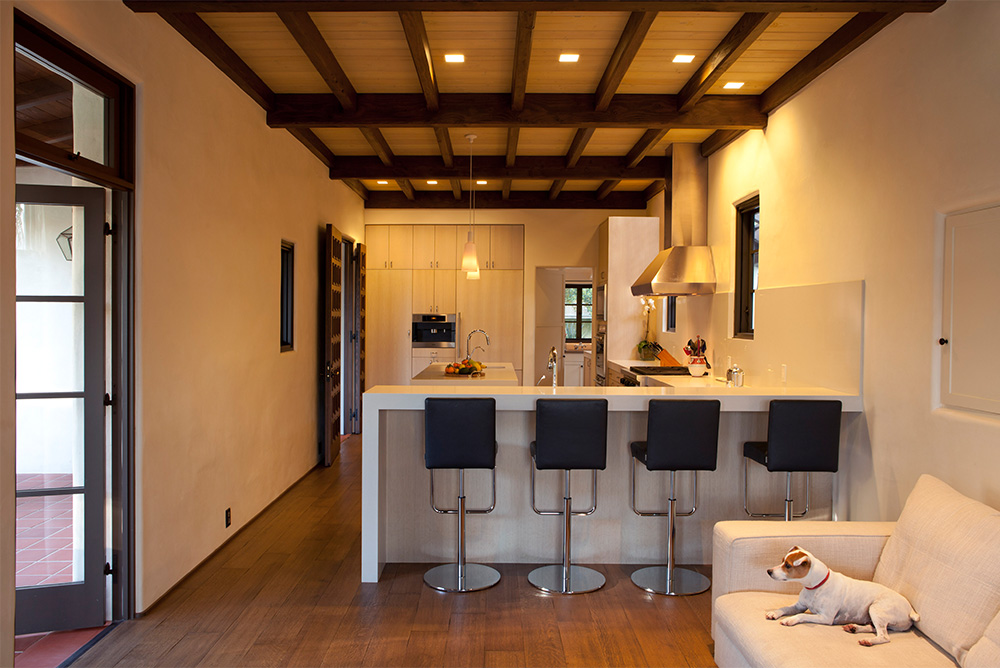
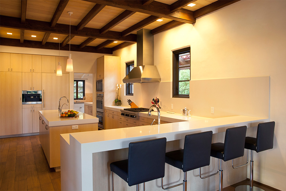
View of the kitchen showing the eating counter. The caesarstone countertop also continues up to be a monolithic backsplash.
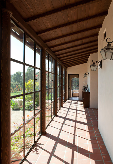
Glassed-in walkway to the Master Suite
Echoing the pergola around the rest of the courtyard, Dutton Architects specified Hopes steel sash windows to maintain the feeling of an open pergola, but protected from the elements. The door at the end leads to the master suite which steps down to the level of the pool terrace.
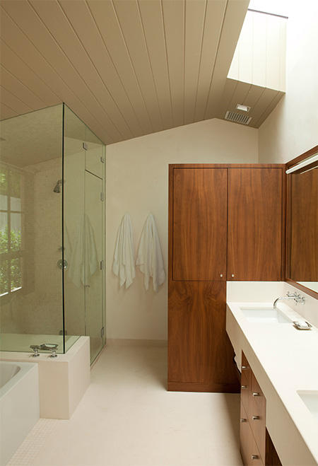
Master bathroom of stone, wood, and light
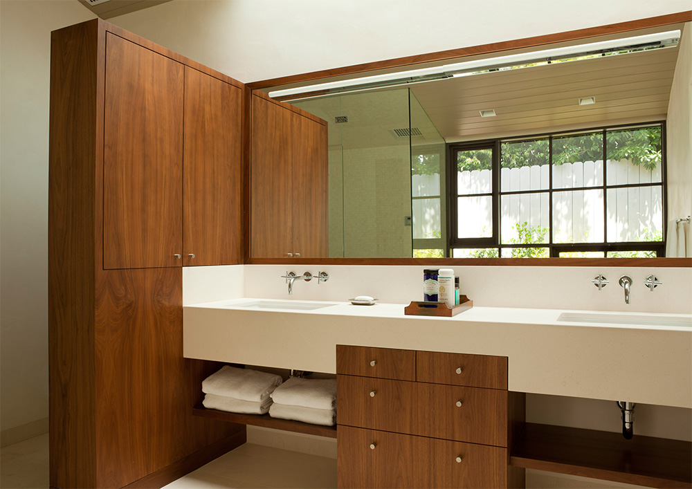
The master bathroom features a vaulted ceiling in stained douglas fir, a freestanding walnut cabinet that doubles as a privacy divider for the toilet, a limestone counter that integrates with the tall cabinet, a limestone floor, and a steam shower.
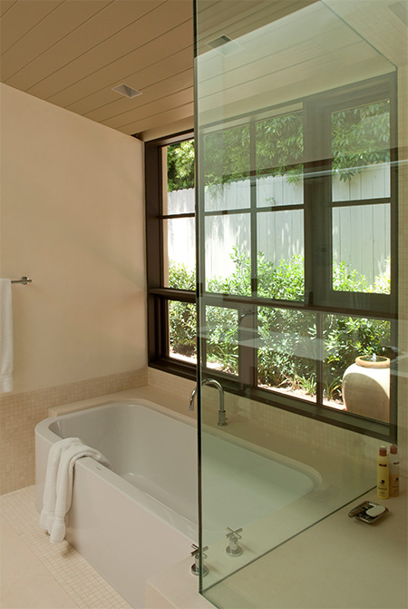
Bathing in the garden
A large steel sash window is placed next to the tub. An awning window right next to the head of the tub opens so that the bather feels they are in the garden. A small fountain has been placed just outside to create a tranquil environment. The bathtub is a ‘Happy D’ from Duravit, and emerges from the custom limestone tub deck.
View of the custom walnut and limestone vanity.
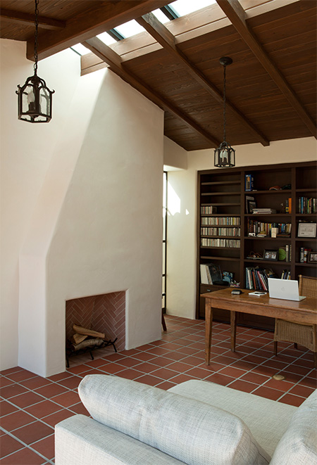
A home office that feels like it’s outside
A home office has been placed between the main house and the master bedroom suite in an outside area. The terracotta floors of the terrace come into this room, and the high wood ceilings are a continuation of the pergola roof. By using the Hopes steel-sash doors and windows we were able to make this outdoor space actually an interior home office space. A simple fireplace for warming the area is profiled to integrate with the full length ridge skylight. Light comes in from two sides and the ceiling, further enhancing this outdoor-feeling room.
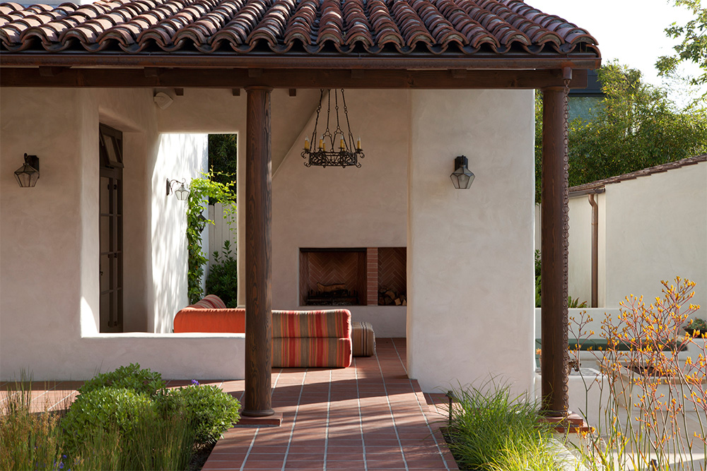
An outdoor room with a fireplace
The roof of the main house continues to cover an outdoor room that can be used for casual dining, shaded lounging during the day, or simply relaxing by the fire in the evenings.
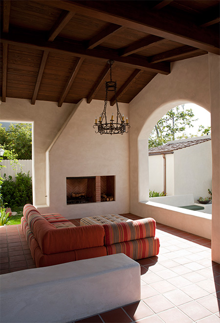
The details of this outdoor but covered room integrate the exterior and interior details.
The flooring and roof match the pergola, and the massive walls and fireplace, along with the custom historic iron chandelier, make it feel like a room. The arched opening frames views of the Santa Monica mountains.
View of the main house and courtyard from the guest house, at a lower level on the site.
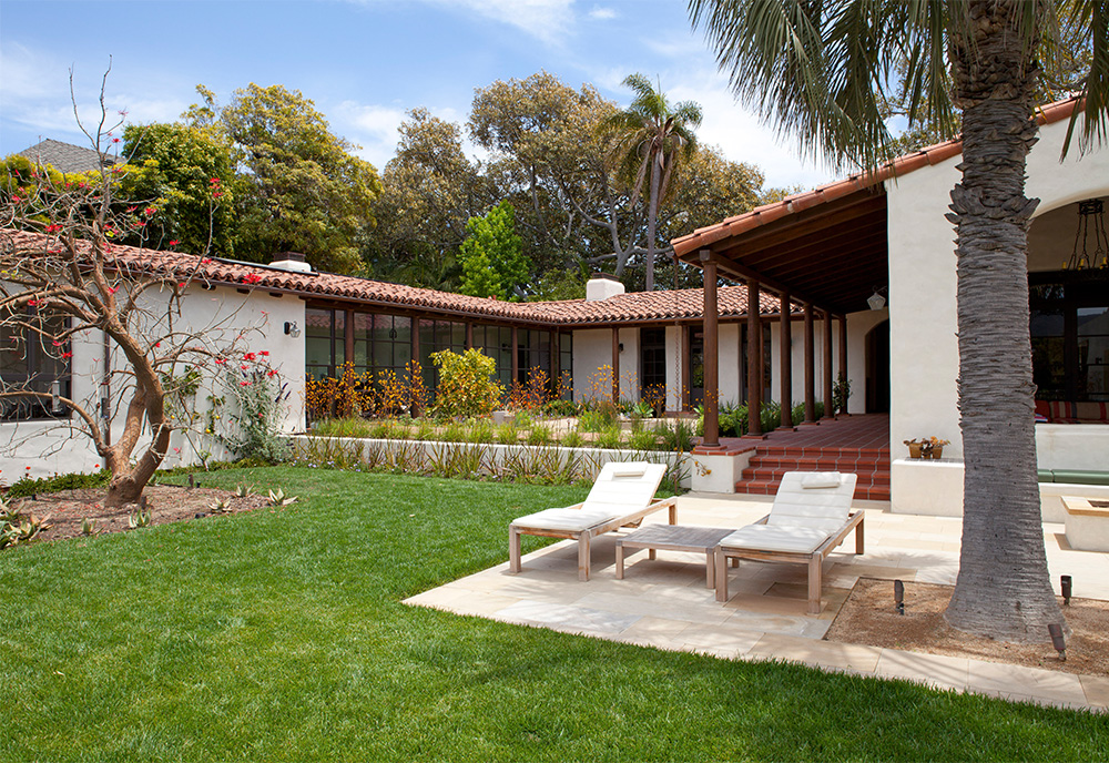
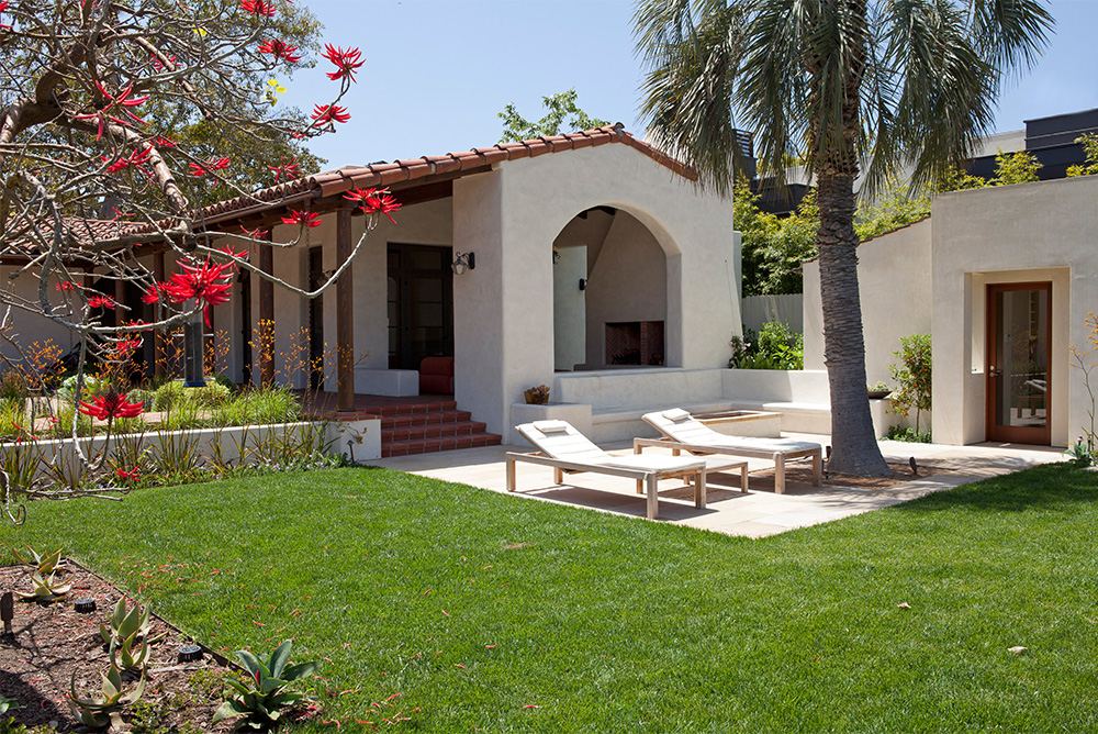
View of the covered outdoor room, and the sun terrace.
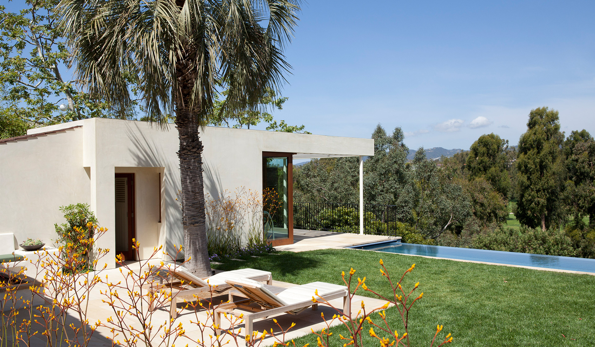
A pool house with a contemporary echo
The guest house is conceived by Dutton Architects as a contemporary echo of the original house. The same materials were used, but in more modern ways. The thick plaster walls her have a more precise corner, instead of the 3″ radius of the original adobe house corners. The wood detailing is no longer stained douglas fir timber, but a more modern and minimal composition in mahogany. The roof is primarily flat, with a cantilevered overhand in stucco and slats as opposed to the heavier sloped overhangs of the main house pergola. And on the part of the roof that is sloped, we use a flat, square terra cotta tile instead of the traditional undulating roof tiles of the main house.
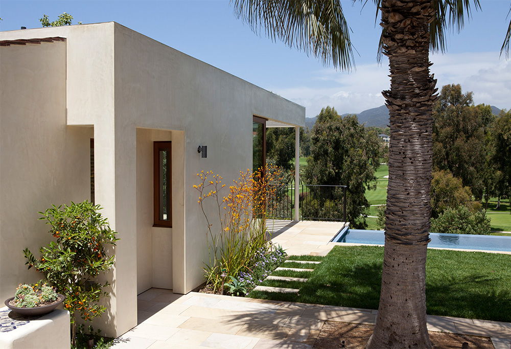
A view of the guest house and the mountains beyond.
Poolside seating with a view
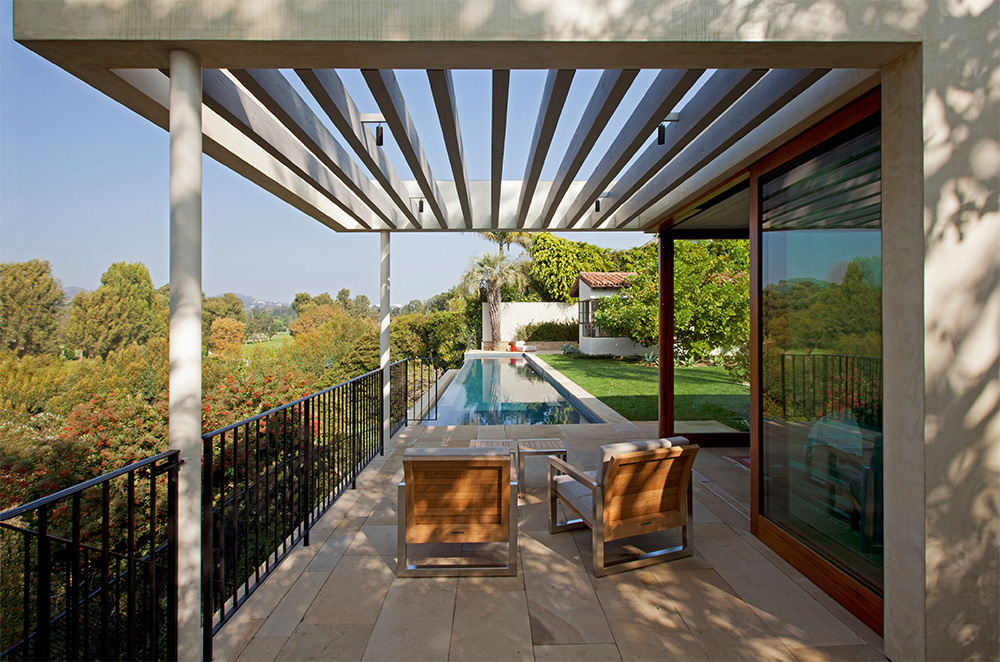
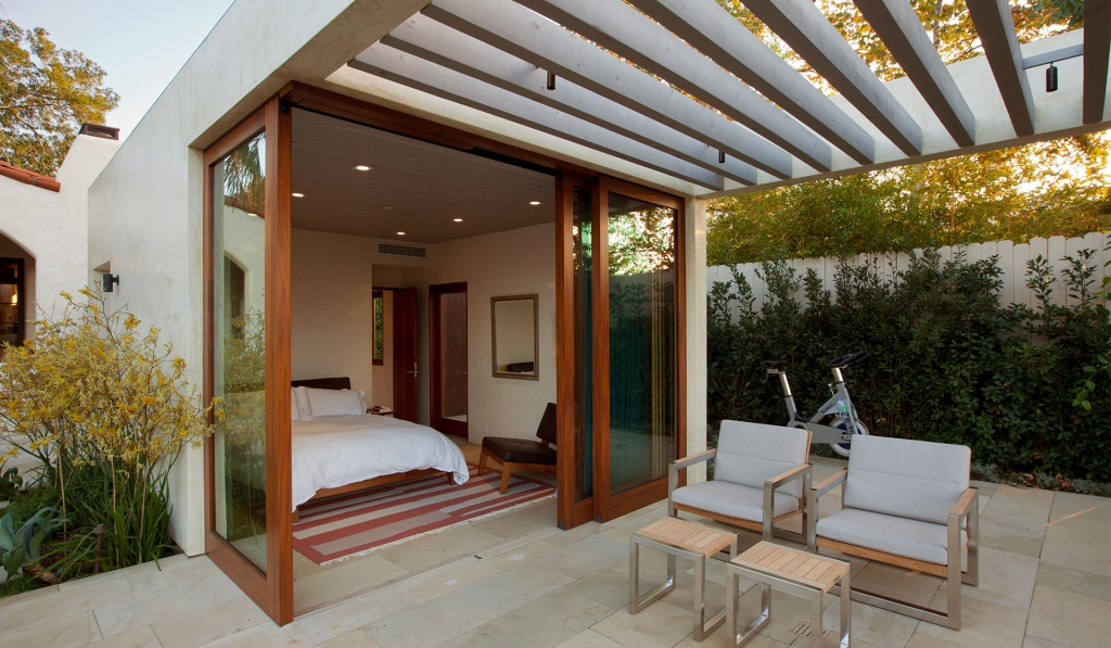
The guest house opens up to a covered terrace through full-height ‘lift and slide’ doors. The Santa Barbara stone of the pool deck continues in as the floor of the guest house.
